Data is everywhere. You open five tools, ten tabs, and still struggle to see what is actually going on. That is where dashboard reporting starts to make sense.
Instead of jumping between platforms, everything comes into one place. You see numbers, trends, and changes without digging through reports.
In this blog, we will look at what dashboard reporting means, the different types you will come across, how it helps teams, and how you can build one that actually works.
What is Dashboard Reporting?
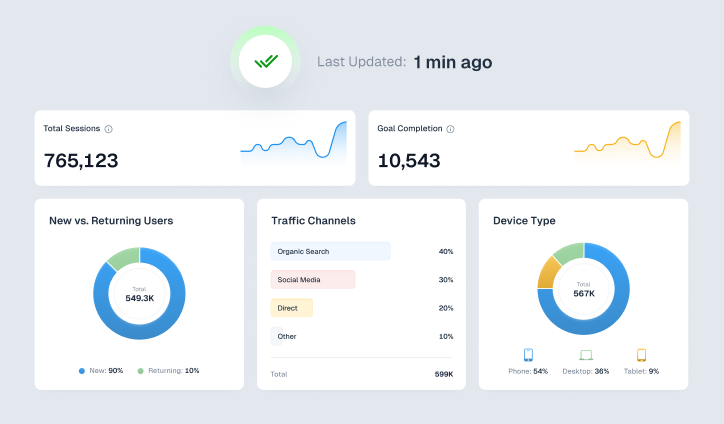
Dashboard reporting is a way of collecting data from different sources and showing it in one clear, visual view. Instead of reading long reports, you get charts, numbers, and summaries that update in real time or at regular intervals.
The idea is simple. You should be able to open a dashboard and understand what is happening without needing to analyze spreadsheets. It helps teams track performance, spot patterns, and make decisions faster.
Related Read – Dashboard vs Report – What is the Difference?
Types of Dashboard Reporting
Not all dashboards serve the same purpose. Some are meant for quick updates, while others help you look at long-term progress or deep analysis. Here is how they are usually divided.
-
Operational Dashboard
An operational dashboard focuses on what is happening right now.
For example, you might track today’s website visitors, number of orders placed, or support tickets raised. These dashboards are often used by teams that need quick updates throughout the day.
The focus here is simple. What is going on at this moment, and does anything need immediate attention?
-
Strategic Dashboard
A strategic dashboard looks at the bigger picture. It is not about hourly or daily changes. It is about long-term progress.
For example, a CEO or leadership team might use a dashboard that shows total revenue growth, yearly targets, and overall business performance across quarters. Instead of focusing on daily fluctuations, they are looking at whether the company is moving in the right direction over time.
The focus here is. Are we achieving our goals?
This dashboard is usually viewed less frequently compared to operational ones, but it plays an important role. It helps leadership make decisions about future plans, investments, and business direction.
-
Analytical Dashboard
An analytical dashboard goes deeper into the data. It is not just about what happened, but understanding the reason behind it.
For example, let’s say you ran multiple marketing campaigns over the last six months. An analytical dashboard would help you compare performance across channels like search ads, social media, and email campaigns. You might notice that one channel consistently performs better than others.
This type of dashboard helps you break down trends, compare time periods, and find patterns that are not obvious at first glance.
The focus here is. Why did this happen?
It is mostly used by analysts, marketers, and teams that need to make data-driven decisions based on past performance.
-
Tactical Dashboard
A tactical dashboard sits between strategy and daily operations. It focuses on improving performance while work is still in progress.
For example, a marketing team might track how their campaigns are performing compared to set targets. If one campaign is underperforming, they can adjust budgets, creatives, or targeting without waiting until the campaign ends.
The focus here is. How can we improve performance?
This dashboard is useful for team leads and managers who are responsible for making sure targets are met.
Related Read – 4 Types of Dashboards Every Business Needs in 2026
Benefits of Dashboard Reporting
Dashboard reporting changes how teams interact with data. It removes delays and makes information easier to act on. Here’s a closer look at its benefits:
-
Saves Time
Without dashboards, teams often spend hours creating reports manually. Data has to be pulled from different sources, organized, and then shared.
With dashboard reporting, this process becomes automatic. Data updates on its own, which means you spend less time preparing reports and more time actually using the data.
-
Helps Secure Stakeholder Buy-In
When stakeholders see clear numbers and visuals, it becomes easier for them to understand performance.
For example, instead of explaining campaign results in words, you can show a simple dashboard that highlights growth, drop-offs, and returns. This makes conversations more direct and helps build trust.
-
Improves Team Alignment and Collaboration
When everyone is looking at the same dashboard, there is less confusion.
Marketing, sales, and leadership teams can all refer to the same data instead of relying on separate reports. This keeps everyone aligned and reduces miscommunication.
-
Helps Detect Issues Early
Dashboards make it easier to spot problems as they happen.
For instance, if your website traffic suddenly drops or conversions start falling, you will notice it immediately on the dashboard. This gives you time to fix the issue before it affects overall performance.
-
Increases Visibility and Transparency
Data is no longer limited to a few people.
With dashboards, teams can access information whenever they need it. This creates a more transparent environment where performance is visible and easy to track.
-
Keeps You on Track with Goals
When your targets are visible on a dashboard, it becomes easier to measure progress.
For example, if your goal is to reach a certain revenue number or lead count, you can track how close you are in real time. This helps teams stay focused and adjust their efforts when needed.
Key Features of the Best Dashboard Reporting Tools
Not every dashboard tool gives the same experience. The ones that work well usually include a few important features like:
-
-
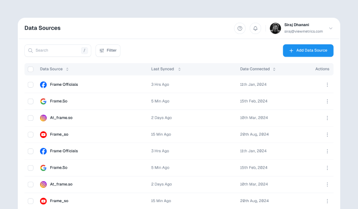
Data Integration
A good tool should bring data from multiple platforms into one place. For example, you might combine website analytics, CRM data, and ad performance into a single dashboard instead of checking each tool separately.
-
Flexible Data Exploration
You should be able to filter and adjust what you see. For instance, viewing campaign results by channel, date range, or audience segment helps you get more clarity.
-
AI-Based Insights
Some tools can highlight unusual patterns or underperforming areas automatically. Instead of manually scanning data, the tool points you in the right direction.
-
Visual Representation
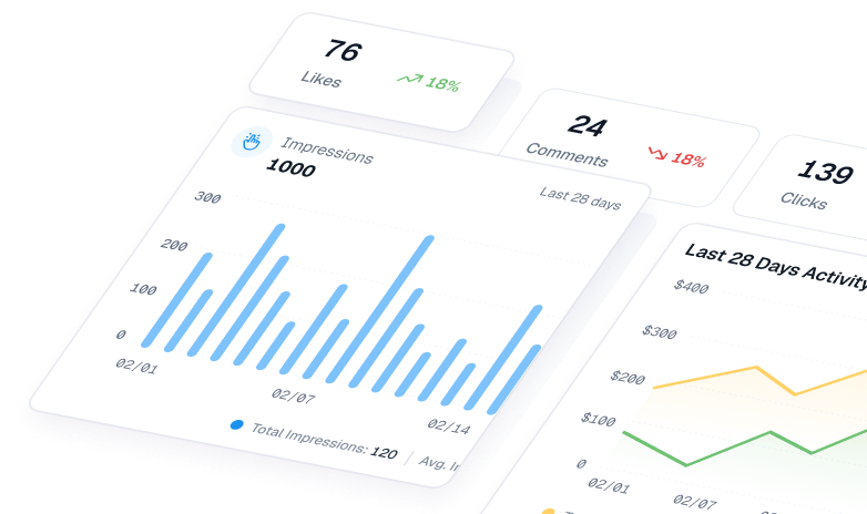
Clear charts, graphs, and scorecards make it easier to understand trends. A simple line graph showing growth over time is often more useful than a long table of numbers.
-
Mobile Access
You should be able to check your dashboard even when you are not at your desk. This is useful during meetings or when quick updates are needed.
-
Unified Interface
Everything should be available in one place. Revenue, traffic, conversions, and other metrics should not be scattered across different screens.
-
Supports Data Understanding
Even team members who are not comfortable with data should be able to use the dashboard. Simple visuals and clear labels help more people engage with the data.
-
How to Create a Dashboard Report
Creating a dashboard is not just about adding charts. It needs a clear plan so that it actually helps the person using it.
-
Define Objectives and Audience
Start by understanding who the dashboard is for.
A marketing manager might need campaign-level data, while a business owner might only want to see overall growth and revenue. When you know the audience, it becomes easier to decide what to include.
-
Gather and Integrate Data
Next, collect data from all relevant sources.
This could include analytics platforms, ad accounts, CRM systems, or internal databases. The goal is to bring everything together so you are not relying on multiple tools.
-
Select Key Metrics (KPIs)
Not every number needs to be on the dashboard.
Choose only the metrics that actually matter. For example, if your goal is lead generation, focus on leads, cost per lead, and conversion rates instead of adding too many unrelated numbers.
-
Structure the Dashboard Layout
How your dashboard looks matters.
Place the most important information at the top so it is visible immediately. Supporting data can come below. Keep the layout clean so users are not overwhelmed.
-
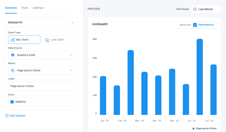
Choose the Right Visualizations
Different types of data need different visuals.
For example, trends over time work well with line charts, while comparisons between categories are easier to understand with bar charts. Choosing the right format makes the dashboard easier to read.
-
Add Interactivity and Exploration
A static dashboard can feel limited.
Adding filters or drill-down options allows users to explore data further. For instance, clicking on a campaign might show deeper insights into its performance.
-
Enable Real-Time Data Updates
Whenever possible, your dashboard should update automatically.
This ensures that the information is always current. You do not have to wait for someone to refresh or rebuild reports manually.
-
Enable Sharing and Accessibility
A dashboard is only useful if people can access it easily.
Make sure it can be shared with teams and stakeholders without complications. This improves collaboration and keeps everyone informed.
-
Test and Validate
Before using the dashboard regularly, check if everything is accurate.
Make sure the numbers match your source data and that the layout makes sense. This step avoids confusion later.
-
Monitor and Optimize
A dashboard is not something you build once and forget.
Over time, your needs may change. You might need to add new metrics or remove ones that are no longer useful. Regular updates keep the dashboard relevant.
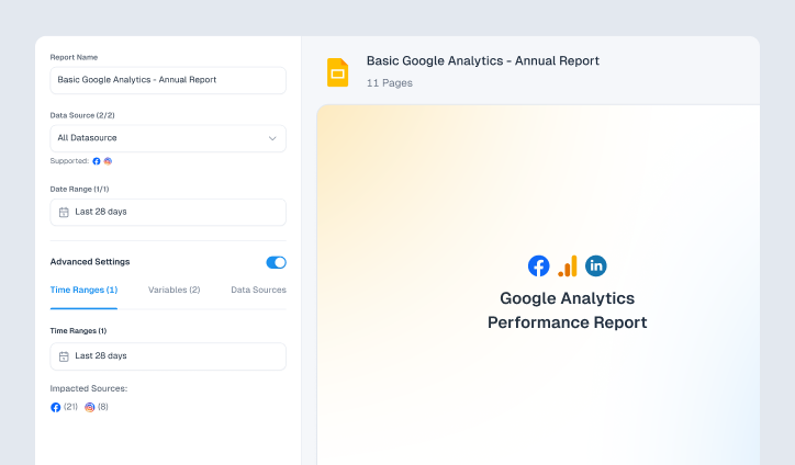
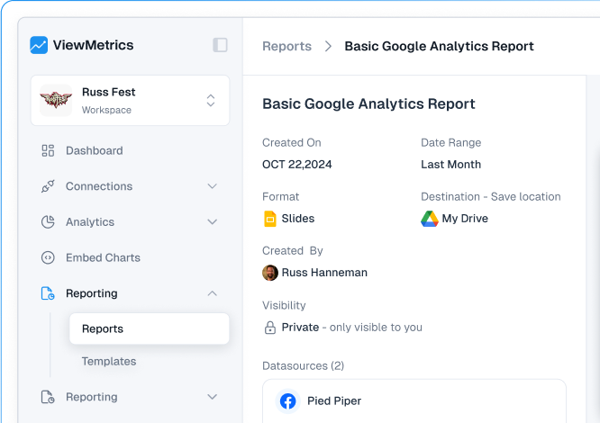
How ViewMetrics Helps You Build Different Dashboards
Managing data across multiple platforms can quickly become messy. This is where ViewMetrics fits in naturally by bringing everything together in one place.
-
-
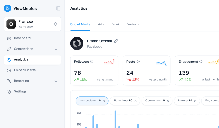
Marketing Dashboard Reporting
With ViewMetrics, you can combine data from your ad platforms and website analytics into one live dashboard.
Instead of checking each platform separately, you get a single view that shows how your campaigns are performing across channels. This makes it easier to compare results and adjust strategies without delay.
-
Executive Dashboard Reporting
For leadership teams, ViewMetrics helps simplify complex data.
You can view revenue performance, return on investment, and growth trends together in a clean format. This allows decision-makers to quickly understand how the business is performing without going into too much detail.
-
Operational Dashboard Reporting
ViewMetrics also supports real-time tracking.
For example, you can monitor daily campaign activity, incoming leads, or changes in traffic as they happen. This helps teams react quickly instead of waiting for end-of-day reports.
-
Sales Dashboard Reporting
Sales teams can use ViewMetrics to track their pipeline and performance.
You can see how many deals are in progress, how many have been converted, and how revenue is shaping up. This gives better clarity on where efforts are needed to close more deals.
-


View All Your Marketing and Website Data - Instantly
 Connect Instagram, Mailchimp, Google Analytics & more
- Pre-built dashboards, no setup needed
- Save hours on reporting every week
Closing Thoughts
Dashboard reporting is not just about visuals. It is about clarity. When your data is organised and easy to understand, decision-making becomes faster and more confident.
If you are still managing reports across different tools, it might be time to bring everything together. With ViewMetrics, you can connect your data sources, track performance in real time, and keep your entire team aligned.
Get started with ViewMetrics and bring all your reporting into one place without the usual hassle.
Frequently Asked Questions (FAQs)
-
What is the purpose of dashboard reporting?
Dashboard reporting helps you track performance, monitor changes, and make decisions using real-time or regularly updated data in a visual format.
-
What is the difference between dashboards and reports?
Reports are usually static and detailed, often shared at fixed intervals. Dashboards are visual, interactive, and updated more frequently.
-
What is dashboard reporting in Excel?
In Excel, dashboard reporting involves using charts, pivot tables, and formulas to present data in a visual format within a single sheet or workbook.
-
Can dashboard reporting integrate multiple data sources?
Yes, most modern tools allow you to combine data from different platforms like analytics tools, CRMs, and ad networks into one dashboard.
-
What should a good dashboard report include?
It should include clear metrics, simple visuals, relevant data, and an easy-to-understand layout that matches the user’s needs.
-
How often should dashboards be updated?
It depends on the use case. Operational dashboards may update in real time, while strategic dashboards may be reviewed weekly or monthly.