Summary for the Blog
- What is a KPI Dashboard? A KPI dashboard is a visual tool that displays key performance indicators (KPIs) in one place, helping teams monitor business performance in real-time.
- Why are KPI Dashboards important? They simplify data analysis, support better decision-making, and keep everyone aligned on strategic goals.
- What are the features of a good dashboard? Key features include real-time data, customization, clarity, and ease of use across teams and departments.
- Who should use it? From marketing and sales to finance and operations, any team aiming to track progress and optimize performance benefits from KPI dashboards.
Every organization, from small businesses to large corporations, has specific goals and targets they want to achieve. Key performance indicators (KPIs) are a valuable tool for tracking progress towards these goals. A KPI dashboard is a visual representation of key metrics, allowing executives to easily monitor performance and identify trends.
KPIs can help organizations improve their decision-making, enhance operational efficiency, and drive overall success. By understanding how to create and use effective KPI dashboards, you can make better-informed choices and stay ahead of the competition.
In this blog post, we’ll discuss the importance of KPI dashboards, their benefits, and best practices for creating and using them. We’ll also provide real-world examples to illustrate how these dashboards can be used to improve your organization’s performance.
What is a KPI Dashboard?
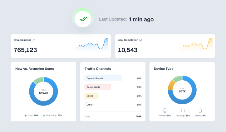
A KPI dashboard is a visual tool that uses charts and graphs to show your key performance indicators. It provides a quick and easy overview of how your company is doing, using important numbers and visuals. Think of it as a central command center where you can see everything at once, helping you make better decisions based on real-time information. These dashboards can be customized for different parts of the company, so everyone has the information they need to make informed decisions.
For example, a KPI dashboard could be used to summarize core business objectives or specific departmental targets. It can help you track progress toward goals, analyze performance, and identify trends early on. With charts and tables, you can compare and understand the details behind the numbers. This can be helpful for people who might not easily understand spreadsheet data alone.
Most importantly, KPI dashboards provide a high-level overview of performance, rather than every single detail. They don’t give you all the answers, but they can help you identify areas of the business that may need further analysis.
Here is a List of 5 KPI Dashboard Examples With Key Metrics to Included

1. KPI Dashboard Examples
An executive KPI dashboard is a tool used by top-level managers to keep track of a company’s overall performance. It provides a clear and concise view of the important metrics that help executives understand the company’s direction and health. This dashboard is designed to give a quick snapshot of essential performance indicators, making it easier for executives to make strategic decisions.
Common metrics in an executive KPI dashboard include:
- Revenue Growth: This shows how much revenue has increased over a specific time period.
- Profit Margins: Displays different types of profit margins, such as gross, operating, and net.
- Customer Satisfaction: Includes scores or ratings that reflect how satisfied customers are.
- Customer Acquisition Cost (CAC): Indicates the expense involved in gaining a new customer.
- Employee Engagement: Reflects how satisfied and engaged employees are.
- Sales Growth: Measures the percentage increase in sales over time.
- Return on Investment (ROI): Assesses the profitability of investments made.
2. Operational KPI Dashboard

Explore Pre-Designed Marketing Report Templates for Agencies & Marketers
An operational KPI dashboard is used by middle managers and operational teams to monitor daily activities and performance. It focuses on metrics related to efficiency, production, and resource use, helping teams improve processes and address any issues in their workflow.
Important metrics often found in an operational KPI dashboard include:
- Efficiency Ratio: Shows how well resources are used to achieve results.
- Production Output: The number of products made or services delivered.
- Inventory Turnover: Indicates how quickly inventory is sold or used.
- Cycle Time: The amount of time needed to complete a task or process.
- Quality Metrics: Measures aspects of product or service quality, such as defect rates or complaints.
- Customer Service Metrics: Includes data like response times and satisfaction scores for customer support.
3. Sales KPI Dashboard
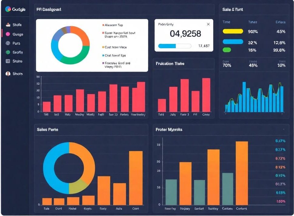
A Sales KPI Dashboard is a tool used to quickly check how well your sales team is performing. It gives sales managers, executives, and other important stakeholders an easy way to keep an eye on important numbers, evaluate performance, and spot potential problems before they affect your business.
Some of the key metrics typically included in a Sales KPI Dashboard are:
- Sales Revenue: The total amount of money earned from sales.
- Sales Growth: The rate at which sales are increasing over time.
- Conversion Rate: The percentage of potential customers who actually make a purchase.
- Average Deal Size: The typical value of each sales transaction.
- Sales Cycle Length: The average time it takes to close a sale from the first contact to the final agreement.
- Customer Retention Rate: The percentage of customers who continue to do business with you over a certain period.
Designed Marketing Report Templates for Agencies & Marketers
4. Marketing KPI Dashboard
A marketing KPI dashboard is a tool designed to help marketing professionals track and improve their strategies. This type of dashboard gives a clear view of how marketing efforts are performing, allowing teams to see which campaigns are working well, which channels are most effective, and where there might be room for improvement.
Some of the key metrics commonly included in a marketing KPI dashboard are:
- Lead Generation: The number of leads generated through marketing activities.
- Conversion Rates: The percentage of leads that turn into customers or take the desired action.
- Cost Per Lead (CPL): The cost associated with acquiring each lead.
- Website Traffic: The total number of visitors to the website.
- Social Media Engagement: Interactions on social media platforms, such as likes, shares, and comments.
- Email Marketing Metrics: Statistics like open rates, click-through rates, and conversion rates for email campaigns.
5. HR KPI Dashboard
An HR KPI dashboard is a tool that provides insights into an organization’s human resources performance. It helps track important aspects like employee satisfaction, turnover rates, and recruitment effectiveness. Some of the key metrics that might be included in an HR KPI dashboard are:
- Employee Turnover Rate: The rate at which employees leave the organization.
- Time to Fill: The average time it takes to fill open positions.
- Employee Satisfaction: A measure of how happy and satisfied employees are with their jobs.
- Training and Development Costs: The expenses related to employee training and development programs.
- Diversity and Inclusion Metrics: Metrics that assess the diversity of the workforce and the success of diversity and inclusion initiatives.
View All Your Marketing and Website Data - Instantly
Connect Instagram, Mailchimp, Google Analytics & more
Pre-built dashboards, no setup needed
Save hours on reporting every week
KPI Benefits for Your Business
KPI dashboards offer you several benefits, such as:
1. Highlighting Important Data
KPI dashboards offer a clear view of important metrics, making it easier to spot trends, unusual patterns, and areas that need attention. This visual format helps stakeholders quickly grasp the overall health of the business, enabling them to make informed decisions.
2. Efficient Decision-Making
By presenting data in an easy-to-understand way, KPI dashboards help decision-makers act quickly. Early identification of potential issues allows for timely actions, preventing bigger problems down the line. These dashboards also reveal hidden business opportunities by showing areas of growth and untapped potential.
3. Transparent Objectives
KPI dashboards help teams and individuals stay aligned with shared goals. By clearly outlining and tracking key performance indicators, everyone knows their role in reaching the organization’s objectives. This transparency encourages accountability and enhances teamwork.
4. Financial Savings
KPI dashboards assist organizations in better-managing resources and cutting costs. By pinpointing inefficiencies and areas for improvement, businesses can streamline operations and avoid unnecessary expenses, ultimately strengthening their financial position.
5. Real-time ROI Analysis
KPI dashboards offer valuable insights into the return on investment (ROI) of various initiatives. By monitoring key performance and cost metrics, businesses can evaluate the success of their strategies and make informed, data-driven decisions. This real-time analysis helps optimize resource use and maximize ROI.
How to Create a KPI Dashboard?
To create a KPI dashboard follow these steps:
1. Choosing the KPIs and Metrics to Track
When creating a KPI dashboard, start by thinking about the questions your end-users need answers to and the information they require. This focus helps you avoid including unnecessary or “vanity” metrics that don’t provide real value.
Concentrate on the most important metrics related to the activity you’re monitoring. For instance, if you’re building a sales pipeline dashboard, there’s no need to include metrics like Customer Lifetime Value (CLTV) or Cost Per Acquisition (CPA) because these aren’t particularly relevant to sales teams.
2. Selecting Relevant Data Sources
Review all the data sources you have and determine which ones are actually relevant to your dashboard. This can be tricky, especially given the variety of tools that businesses use today.
Choose your data sources carefully, as each one adds extra work in terms of setup and ongoing maintenance. You’ll need to connect each source to your dashboard tool, retrieve the correct data, format it properly, and design new charts to present it. Additionally, each data source typically has its own API, which will require regular updates on the backend.
3. Choosing the Right Data Visualization Techniques
Selecting the right data visualization techniques is as crucial as collecting the data itself. The main goal is to find the most practical way to present your information through charts and graphs that tell a clear and compelling story.
For instance, if your aim is to compare different sets of values, bar charts, and scatter plots are effective choices. If you’re looking to analyze trends over time, line charts and column charts work well. To understand data distribution, you might opt for a Mekko or Marimekko chart.
However, creating these visualizations from scratch isn’t always straightforward. It requires a solid understanding of data analysis and experience with business intelligence tools to ensure the visuals accurately represent the data and are easy to interpret.
4. Creating an Intuitive Dashboard Layout
Designing an intuitive dashboard layout is about more than just arranging charts and graphs on a screen. It’s about creating a user-friendly interface that makes it easy to access and understand the data. This involves strategically placing elements so that the most critical information is immediately visible, and the overall design is clean and uncluttered.
5. Ensuring Data Accuracy and Consistency
When working with data, ensuring accuracy and consistency is important. This means double-checking that all data points are correct and consistently formatted across different sources and reports. Accurate and consistent data forms the foundation for reliable analysis and decision-making, so it’s important to take the time to verify everything before moving forward.
KPI Dashboard Best Practices
When creating a KPI dashboard, it’s important to follow best practices to ensure it’s user-friendly. Take a look at some of the best practices below:
1. Align KPIs with Strategic Goals
Always consider your audience and their specific needs when creating a KPI dashboard. What information are they looking for? Which KPIs will help them make meaningful comparisons? By designing the dashboard with your audience in mind, you can ensure that it includes the most relevant data.
2. Keep the Design Simple
While it might be appealing to include every chart and graph you can think of, adding too much can make your KPI dashboard cluttered and less effective. Stick to the most important data to keep the design clean and focused. Including too many details, even if they seem interesting, can take attention away from the main insights you want to highlight.
3. Aim for Visual Consistency
Having a visually consistent KPI dashboard is key to clear communication. By using the same colors, styles, and design elements throughout, you create a dashboard that’s easier to read and understand. This consistency helps key stakeholders quickly interpret the data and grasp the important insights.
4. Continuously Monitor and Refine
A KPI dashboard isn’t a static tool. Regularly review and update it to ensure it aligns with changing business goals and priorities. Pay attention to trends and anomalies, and make adjustments as needed.
5. Balance Information Density
While it’s important to include relevant KPIs, avoid overwhelming your dashboard with too much data. Strike a balance between providing valuable insights and keeping the dashboard easy to understand. Consider using filters or drill-down options to allow users to focus on specific areas of interest.
6. Use Appropriate Visualizations with Clear and Concise Labels
Choose visualizations that effectively convey the data, such as line charts for trends, bar charts for comparisons, and pie charts for proportions. Use clear and concise labels to explain what each visualization represents. Avoid using overly complex charts or cluttered visuals that can confuse viewers.
7. Test Dashboard Usability
Before deploying your dashboard, test it with users to ensure it is easy to navigate and understand. Gather feedback on the layout, design, and overall effectiveness of the dashboard. Make necessary adjustments based on user input to create a dashboard that meets the needs of your audience.
Common KPI Dashboard Mistakes
When you are setting up you are KPI dashboard you must avoid these common mistakes:
- Choosing KPIs That Don’t Align with Your Strategic Goals: It’s important to track metrics that matter, but not every metric deserves to be a Key Performance Indicator (KPI). Focus on those that directly impact your strategic objectives.
- Using Vague or Poorly Defined KPIs: Make sure your KPIs are clearly defined and measurable. Work with your team to specify exactly how each KPI will be tracked. Without this clarity, achieving your goals becomes much more difficult.
- Setting Unrealistic KPI Targets: Instead of aiming too high, set achievable targets based on historical data, available resources, and current strategies. Consider breaking down goals into short-term and long-term targets for better focus.
- Tracking KPIs Without Assigning Responsibility: Every KPI needs an owner—someone who is accountable for monitoring progress, reporting results, analyzing data, and taking action. Accountability ensures that KPIs are more than just numbers on a dashboard.
- Failing to Act on Your KPIs: KPIs are tools to guide your decisions, not just data to track. Whether you’re hitting your targets or falling short, use this information to make informed decisions and take appropriate action.
Learn More – What is the Difference Between Dashboards and Reports?
Closing Thoughts
Monitoring your KPIs is crucial for making informed decisions and driving business success. Crafting clear and customized dashboards can be challenging, but ViewMetrics simplifies this process by offering an intuitive platform for building tailored reporting dashboards. Transform raw data into visually compelling reports with ViewMetrics, and automated reporting and dahsboard tool and easily track progress, spot trends, and make data-driven decisions.
View All Your Marketing and Website Data - Instantly
Connect Instagram, Mailchimp, Google Analytics & more
Pre-built dashboards, no setup needed
Save hours on reporting every week
Frequently Asked Questions About KPI Dashboard
What is the difference between KPI Dashboard and KPI Reporting?
A KPI dashboard is a visual summary of your most important metrics, giving you a quick snapshot of how your business is performing. A KPI report goes into more detail, analyzing these metrics over time and comparing them to see trends and patterns. This helps you make better decisions.
How many KPIs should be on a dashboard?
The best number of KPIs for a dashboard depends on what you’re trying to achieve. It’s important to avoid too much information. Aim for a dashboard that’s clear and easy to understand. Five to ten KPIs that are relevant to your goals is usually a good starting point. This will help people quickly see the key points and make informed choices.
What are the key components of a KPI dashboard?
A good KPI dashboard should include the following:
- KPIs: The most important metrics for your business.
- Visualizations: Charts, graphs, and other ways to show the data clearly.
- Filters: Options to customize what you see based on different criteria.
- Interactive elements: Features that let you explore the data in more detail.
How often should a KPI dashboard be updated?
How often you update your dashboard depends on the type of KPIs you’re tracking and the needs of your business. You might update it in real-time, daily, weekly, or monthly.
Can I create a KPI dashboard myself?
Yes, you can create a basic dashboard using tools like spreadsheets or data visualization software. For more complex dashboards, you might want to consider using specialized business intelligence software.


